
Raw data and information presented in numbers or complex explanations can be difficult to understand and aren’t suitable for everyone. People are visual learners, and when using charts or diagrams to represent your data, it is more likely to be understood and remembered.
When you need to present and show your data, the best way to do that is by using charts or diagrams. Charts offer your current data or forecasted data. They are the visual form that shows your data, and it will be easier to share them.
Widely used chart types are:
- Flowchart
- Pie Chart
- Gantt chart
- Waterfall chart
- Gauge chart
- Funnel chart
- Bullet chart
We summed up some of the best chart-making tools to visually show all your relevant data.
So let’s begin!
1. Vizzlo
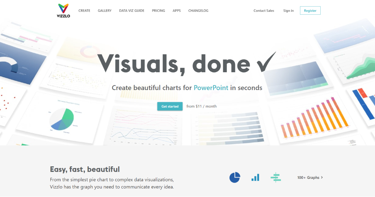
Vizzlo is a chart-making tool that will create charts you can use for Google Slides or PowerPoint. With Vizzlo, you will be able to develop around 100+ graphs, all you need to do is select a chart type, and Vizzlo will do the rest. From offered charts, use ones in Selected Wizards, By Use Case, or By Chart Type.
Vizzlo chart maker can be used as a plug-in, cloud support, or desktop app. Vizzlo is suitable for any business or education, and it has an interface that is easy to navigate. You don’t need to have any particular skills to use Vizzlo chart maker, and this tool will transform even complex data and info into beautiful charts.
Vizzlo charts are customizable, and you can upload your business design fonts, layouts, and logo. With this, you will have a brand-safe design for everyone in your organization.
Vizzlo has three paid plans Professional, Teams, and Enterprise, and they have a 14-days free trial so you can see how Vizzlo works.
2. Microsoft Visio
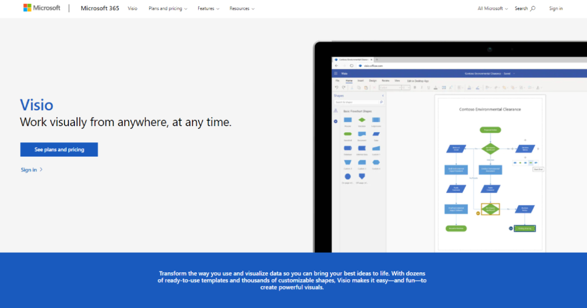
Microsoft Visio is an excellent chart-making tool a superb option if your team already uses Microsoft 365. Visio has ready-to-use templates and customizable shapes, so you can easily visualize your ideas.
Pre-made templates are available with Visio desktop and web apps, enabling you to visualize your data anywhere and share it with your team. If you are Microsoft 365 subscriber, you can print and share diagrams and add comments into already made charts.
Visio will automatically make organizational charts using your or your team’s data from Excel, Exchange, or Azure.
You can check Visio Plans and Pricing on its website.
3. Moqups
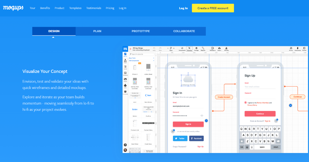
Moqups chart-making tool is a cloud-based one, and you will be able to work with it remotely. Moqups doesn’t require the user to upload or download files with data, so if your team is working remotely, all data will be synced and presented in real-time.
Moqups design tools for creating charts are functional, flexible, and easy to use from anyone in your team. Moqups has ready-to-use Stencils, and they cover all crucial use-cases for the web or mobile app chart design. Elements used with Moqups are all drag & drop ones, so creating charts with this tool is very easy.
This tool has a library with Icon Sets, you can import images from desktop or apps that you already use, and it has integrated Google Fonts.
Moqups has Solo, Team, and Unlimited pricing plans, and you can choose one depending on your needs.
4. Infogram
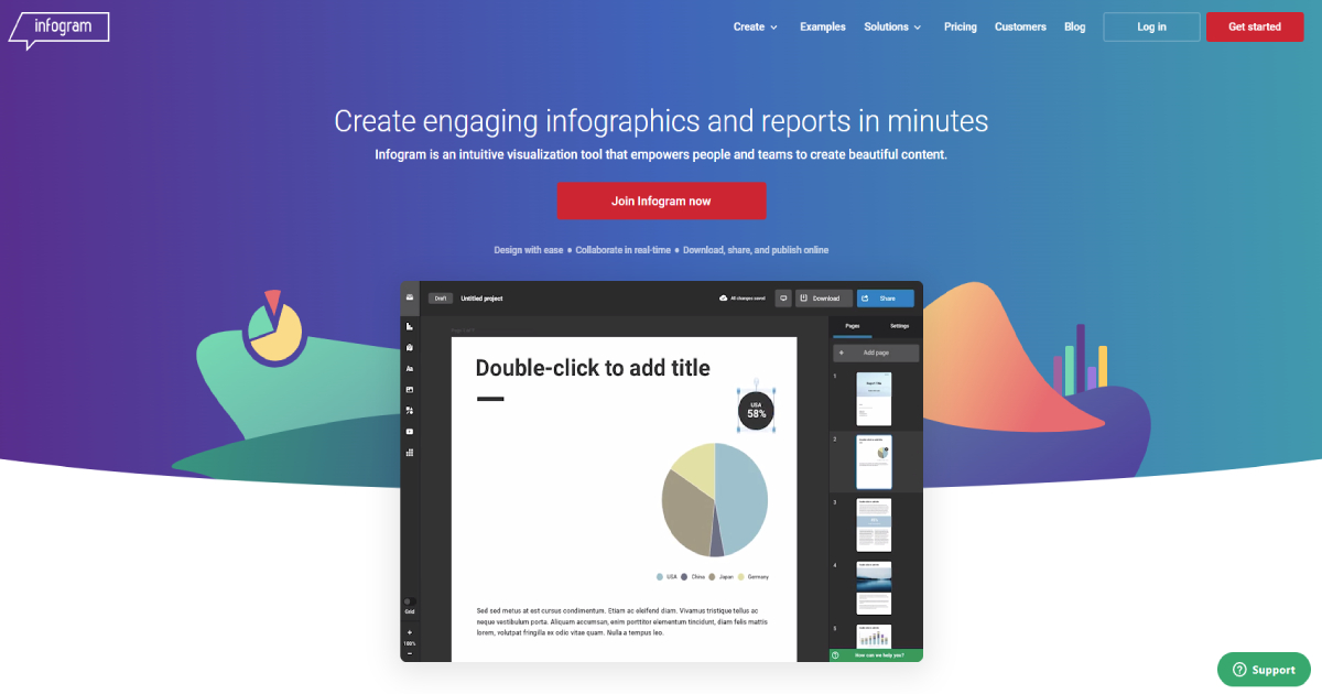
Infogram is an infographic-making tool that will give you options to download, share and publish your charts online. The made chart will be an accurate and visually appealing one. You and your team will work in a real-time environment, so all chart data and content will be available for everyone in your group.
Infogram allows you to use pre-made templates, or you can customize templates that are in tune with your brand, colors, logo, and fonts. Valuable features of Infogram are its interactive charts that have tooltips, linking, clickable legends and tabs,
Infogram offers a Basic free plan and four paid plans Pro, Business, Team, and Enterprise.
5. Visme
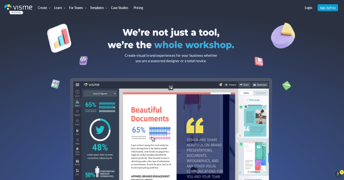
Visme is an online chart maker tool. Visme graph maker will help you create stunning graphs using its 30+ premade graph templates. Created graphs you will be able to share or download, and Visme allows live data integration.
You can easily import all data that you like to present. You will have the ability to show your data the best way possible. Using Visme, you can try different graphs, choose one that suits you the most, and you won’t lose any data in this switching process.
Visme chart maker tool has a free library of chart templates, or use your brand fonts and colors for creating a customizable chart for your business. All tools are drag and drop, and your final chart can be embedded or shared online.
Visme has a Basic free plan and Personal, Business, and Enterprise paid plans.
Conclusion
It doesn’t matter if you are a designer; use chart-making tools to easily create and present relevant data for your team, stakeholders, or customers. Charts are great to use in a learning process. These chart-making tools can help teachers quickly deliver a large amount of data visually to their students.
