Businesses often underestimate the power of a well-placed logo. Whether it’s on digitally generated invoices, printed menus, or retail receipts, a logo plays a critical role in brand reinforcement and trust formation. When used correctly, this visual symbol goes beyond aesthetics—it’s a strategic branding tool.
TL;DR
Using a logo on invoices, menus, and receipts not only reinforces brand identity but also builds customer recognition and trust. Ensure the logo placement is consistent, legible, and aligns with other brand elements. Tailor the logo usage based on the document’s purpose—subtle on receipts, prominent on menus. Keep the overall layout clean, and ensure the logo doesn’t overshadow important content.
Why a Logo Matters on Every Document
Visual identity is crucial in every customer-facing interaction. A business logo effectively communicates the brand’s professionalism and consistency. When included on official documents such as invoices, menus, and receipts, it serves several key purposes:
- Brand Recognition: Frequent logo exposure helps customers remember your business.
- Trustworthiness: Professionally branded documents appear more legitimate and credible.
- Marketing: Even subtle logo displays can support long-term brand recall.
Designing the integration of a logo into these materials should be thoughtful and intentional, not an afterthought. Here’s how to do it right, document by document.
Using a Logo on Invoices
Invoices are formal financial documents, but that doesn’t mean they should be purely functional. A logo adds a professional touch and creates a consistent brand experience.
Best Practices:
- Place the logo at the top-left or top-center of the invoice: These placements are immediately visible and give a branded feel upon viewing.
- Use a high-resolution file: A pixelated or stretched logo appears unprofessional, so maintain clarity with a vector or high-quality image format.
- Match the logo’s colors with invoice text elements: Use your brand’s colors sparingly for headings or highlights, enhancing consistency.

Tips for Digital vs. Printed Invoices:
- Digital Invoices: Ensure the logo is optimized for web use (e.g., PNG with transparency) and doesn’t slow down loading times.
- Printed Invoices: Use CMYK-compatible files and print a few tests to ensure color accuracy and layout cohesion.
Using a Logo on Menus
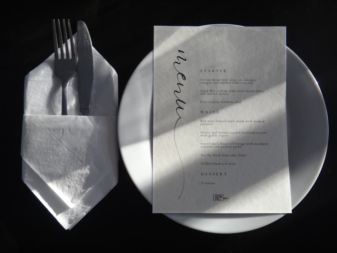
Menus are direct reflections of a hospitality brand. Whether in a cozy café, upscale restaurant, or digital food ordering platform, the logo plays a crucial role in conveying ambiance and quality.
Best Practices:
- Feature the logo prominently on the front page or top corner: This should be the most visible placement, similar to a book cover title.
- Incorporate the logo into the design theme: Match typography, color schemes, or even background patterns with elements from the logo.
- Use the logo as a watermark: Faintly appearing in the background to keep branding subtle but present.

Menu Types & Logo Usage:
- Printed Menus: Opt for high-resolution and possibly embossed logos for a tactile feel that enhances perceived value.
- Digital Menus: Ensure scalability across devices; responsive positioning of the logo keeps it aesthetically pleasing on all screen sizes.
Using a Logo on Receipts
Receipts may seem trivial, but they are often the last point of contact at the end of a transaction. Adding a logo can subtly reinforce brand memory and instill a final sense of customer assurance.
Best Practices:
- Use a simplified version of the logo: Since receipt paper often has limited resolution and color capabilities, use a black-and-white or single-color version.
- Ensure it prints cleanly: Check with your POS (Point of Sale) software that logos aren’t distorted during printing.
- Include space around the logo: Avoid cramming it into a tiny space. A little white space helps it stand out clearly.
Placement Tips:
- Top of the receipt: This is traditionally where customers expect branding and creates instant recognition.
- Bottom of the receipt: Good for branded thank-you messages or special offers with a logo beside them.

Technical Considerations
For every use case—invoice, menu, or receipt—ensure that you’re using the appropriate file formats:
- Vector formats (SVG, EPS): Ideal for printed documents where size scaling without pixelation is essential.
- Raster formats (PNG, JPG): Better suited for digital uses, make sure the resolution is a minimum of 300 DPI for printing.
Also, always test your documents before releasing them publicly. A quick mock-up print or PDF preview can reveal layout issues or poor logo visibility you might have missed.
Maintaining Consistency Across All Media
Your logo doesn’t exist in isolation. For strong brand identity:
- Use consistent size guidelines across platforms and documents.
- Color match precisely with brand guidelines (Pantone, CYMK, RGB as needed).
- Apply the same logo variation (e.g. full, emblem-only, black & white) across similar document types.
Repetition builds familiarity. If the customer sees the same logo treated the same way on an invoice, a menu, and a receipt, it reinforces reliability and attention to detail.
Legal and Ethical Branding Considerations
While prominently displaying your logo helps brand identity, never let it compromise legibility or misstated information. Also consider the following:
- Clear billing information: On invoices and receipts, ensure the logo doesn’t overshadow essential transactional data.
- Menu clarity: Your logo should support the layout, not distract from dish names or prices.
- No deceptive alterations: Never alter the logo in a way that confuses or misleads customers.
Conclusion
Using your logo effectively on invoices, menus, and receipts is a combination of art, design, and strategy. Done right, it can uplift your brand and lend professional legitimacy to even the smallest customer touchpoints. Whether digital or printed, paying attention to size, placement, and clarity can make all the difference in how your business is perceived.
Frequently Asked Questions (FAQ)
- Q: Can I use colored logos on thermal printer receipts?
A: Most thermal printers only support black-and-white printing. It’s recommended to use a grayscale or single-color version of your logo for best results. - Q: Should my logo be the same size across all platforms?
A: Not necessarily. Consistency is key, but scaling your logo proportionally to fit various mediums is important. Just ensure the proportions and spacing guidelines remain intact. - Q: Is it better to place the logo on the top or bottom of an invoice?
A: Top placement is generally more effective for visibility and professionalism. Bottom placement can work for brand reinforcement, but the top is preferred in most industries. - Q: Will adding a logo to receipts slow down my POS system?
A: It can, if the image file is large or incompatible. Optimize the image size and format for quick rendering—usually, a small monochrome PNG works best. - Q: Can I use different variations of my logo on menus and invoices?
A: Yes, but keep it within your brand guidelines. For instance, use emblem-style logos for receipts and full-text logos for invoices. The idea is adaptability without losing identity.


