Your logo is the visual ambassador of your brand. It appears on your website, your products, and most critically, your business documents. Among the most common places businesses overlook brand consistency are invoices, menus, and receipts—critical communication tools that go directly into the hands of clients or customers. The way you implement a logo on these documents can say a lot about your professionalism and attention to detail.
TLDR:
Using your logo on invoices, menus, and receipts boosts your brand visibility and gives your documents a polished, professional appearance. Make sure it’s high-resolution and matches the tone and placement appropriate for each document type. Positioning, color mode, and scale are crucial to ensuring your design remains sharp and impactful. Consistency across documents strengthens brand recognition while building customer trust.
Why Logos Matter on Business Documents
A logo isn’t just a pretty design—it’s a symbol of trust and identity. When placed effectively on functional documents like invoices, menus, and receipts, it:
- Creates brand consistency, keeping your image uniform across all touchpoints.
- Establishes professionalism, giving the impression that you’re organized and thoughtful.
- Promotes recognition, helping customers remember your business for future interactions.
Let’s explore the best practices for incorporating your logo into each of these essential documents.
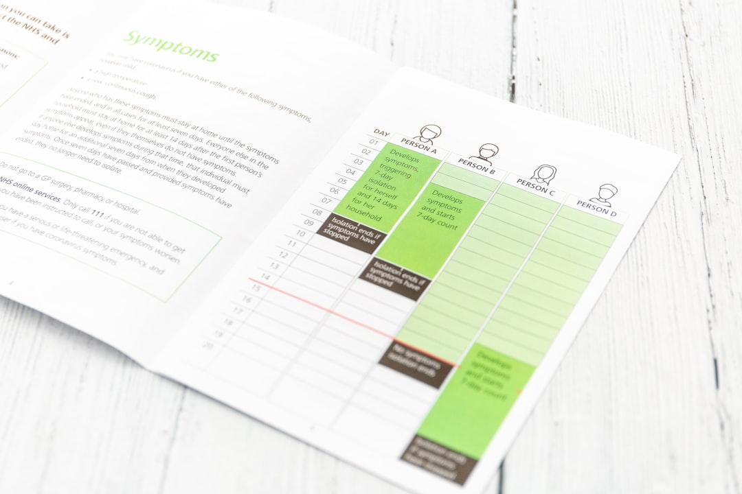
1. Using Your Logo on Invoices
Invoices may be considered administrative, but they are an opportunity to remind your client of your brand and make a lasting impression. After all, they are likely to be referenced by accounting departments and decision-makers.
Best Practices:
- Placement: Top-left or top-center of the document works best. It draws attention while maintaining a formal tone.
- Size: Keep it subtle. The logo should not dominate the page or distract from the invoice’s numerical data.
- Format: Use a transparent PNG or vector file like SVG to ensure sharpness. Avoid pixelated images.
- Color: Match your brand’s color scheme. If your logo is colorful and you’re using a black-and-white print layout, consider a single-color version.
You can also include your logo faintly in the background as a watermark but make sure it doesn’t interfere with text legibility.

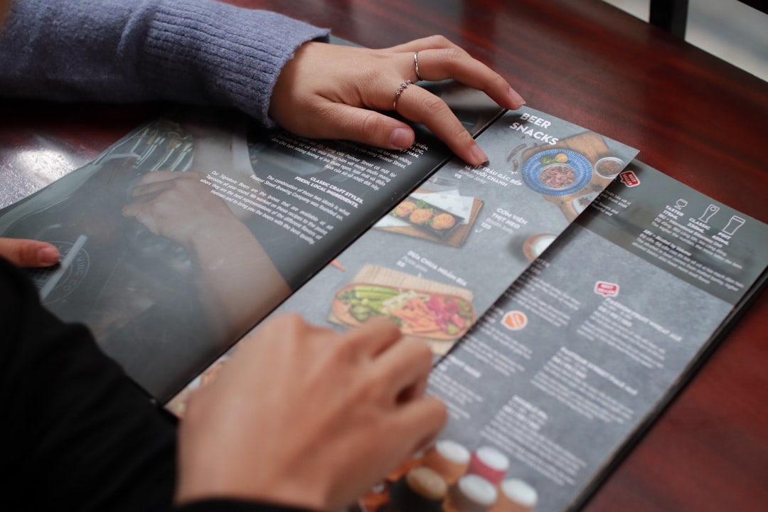
2. Branding Menus with Logos
Menus, particularly in the food and beverage industry, serve as a first impression. Whether it’s a sit-down restaurant or a takeaway menu, branding plays a crucial role in setting the tone of what to expect.
Best Practices:
- Location: Top-center for traditional elegance, or a corner position for minimalist and modern styles.
- Logo Integration: Use your logo not just at the top but subtly throughout the menu. For instance, you can place a grayscale version behind the dessert section.
- Material and Print: High-resolution logos are non-negotiable. If your menu is laminated or printed on textured paper, test print to see how the logo adapts.
- Seasonal Menus: Use your core logo with slight, themed variations for holidays or limited-time promotions.
For digital or touch-screen menus, animated or responsive logos can enhance the user experience and hold attention for longer periods.

3. Logo Placement on Receipts
Receipts might seem too functional to be a branding opportunity, but think again. A printed or digital receipt is often the last customer touchpoint—and a place where your logo can communicate reliability and reinforce brand trust.
Best Practices:
- Size: Very small yet identifiable. The width should not exceed one-third of the receipt’s width.
- Orientation: Horizontal logos work best for narrow paper formats used in POS printers.
- Color Limitations: Most thermal receipt paper has only one color (black), so make sure your logo is legible in monochrome. Simplified versions or alternate marks work well here.
- Position: Place at the top for immediate recognition or at the bottom as a ‘thank you’ branded close.
For digital receipts, you have more creative freedom with color and interactivity. You can even embed clickable logos that lead to loyalty programs or satisfaction surveys.
Common Mistakes to Avoid
Even with good intentions, logo use can backfire if not executed properly. Watch out for these common mistakes:
- Low-Resolution Images: Grainy or pixelated logos make your brand look amateur.
- Overuse: Don’t plaster your logo everywhere; it should support, not dominate.
- Poor Contrast: Logos that blend into the background or make text unreadable are a no-go.
- Incorrect File Formats: Avoid using JPGs if transparency is needed. Stick to PNG or SVG when possible.
Tips for Seamlessly Integrating Your Logo
Strategically placing your logo isn’t just about visual appeal, it’s about brand immersion. Here are some advanced tips that can elevate your documents:
- Create document templates: Design standard invoice, menu, and receipt formats with pre-set logo placements for consistency.
- Use branded colors and fonts: Match headers and key sections with your logo palette to strengthen visual identity.
- Scale appropriately: Always resize logos proportionally. Distorted logos can be off-putting.
- Add secondary brand elements: Consider including a brand tagline below the logo or a custom icon version when the full logo takes up too much space.
Digital vs. Printed: What to Keep in Mind
The medium may dictate how your logo is displayed. Here’s a quick comparison:
| Feature | Digital | Printed |
|---|---|---|
| Color Depth | Full color supported | May need CMYK conversion |
| Resolution | 72–150 DPI is sufficient | 300 DPI required or higher |
| Interactive Elements | Can link logos to websites | N/A |
| Logo Formats | SVG, PNG, JPG | PDF, AI, EPS |
Real-World Examples of Smart Logo Integration
Consider some practical examples:
- Freelancer Invoices: A graphic designer might use a clean, black and white version of their logo at the top of each invoice to maintain a crisp, minimalist presentation.
- Local Café Menu: Featuring a colorful logo on both the cover and inside pages of the menu ensures brand recall while customers browse.
- POS Receipts: A boutique clothing store might include their logo and a short promotional message at the bottom of every printed receipt.

Conclusion: Make Every Impression Count
Logos are more than surface-level design—they are a core part of how your business communicates. By integrating your logo thoughtfully on invoices, menus, and receipts, you elevate even the simplest customer interactions into branded experiences. Take time to implement these small touches, and you’ll be reinforcing your brand identity with every document—not just your marketing collateral.
A subtle, smartly placed logo can leave a long-lasting impression. So don’t just sign off on documents—brand them.


