Creating the perfect logo is a crucial step in building the identity of your sports club, gym, or fitness app. It’s the visual gateway to your brand — the first thing people see, and often the image they’ll remember. The right logo communicates your values, your energy, and your purpose. Whether you’re a grassroots soccer team, a high-tech fitness startup, or an old-school boxing gym, a strong, memorable logo can set you apart.
TL;DR: The logo you choose for your sports-related business or organization matters more than you might think. From minimalist icons to bold typography and animal-based emblems, your logo should reflect your mission, personality, and audience. This guide explores 12 creative and diverse logo ideas for fitness and sports brands that are both visually engaging and effective. Use them as inspiration to design or refresh your own brand identity.
1. Minimalist Icons with Impact
Less is more—especially in modern logo design. Minimalist logos use simple shapes and negative space to craft clever icons that communicate strength, movement, or athleticism. Think of Apple’s apple or Nike’s swoosh—concise but compelling. For fitness brands, a clean dumbbell outline, a stylized running shoe, or even a simple heartbeat line can do wonders.
2. Typography-Based Logos
If you prefer keeping it straightforward, typography logos rely strictly on your brand name, customized with bold or athletic fonts. Typeface choice is critical here; thick, uppercase sans-serifs often convey strength and reliability, while italic or slanted fonts imply speed and motion. Gradients and colors can also add a dynamic flair to what might initially seem like a basic name treatment.
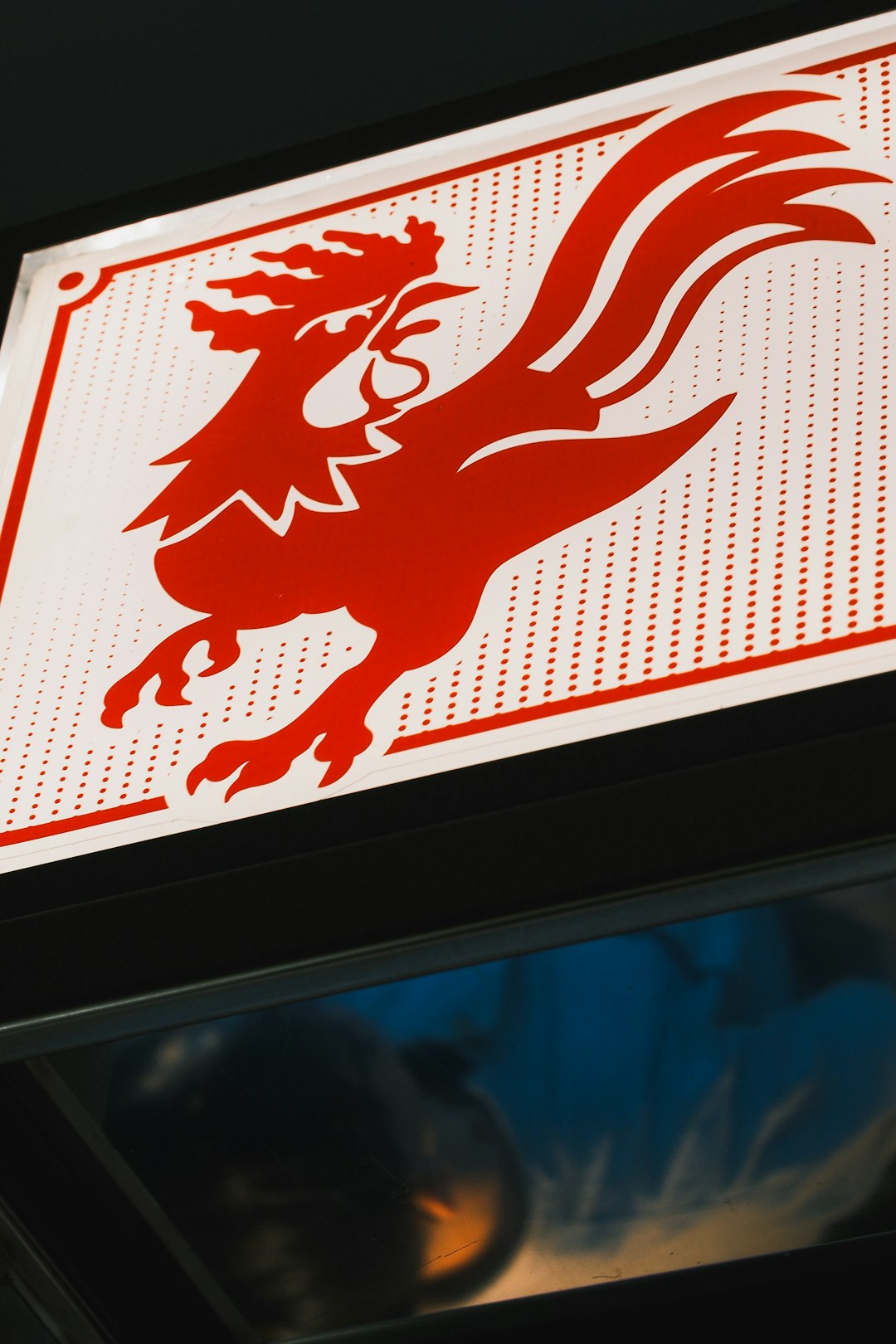
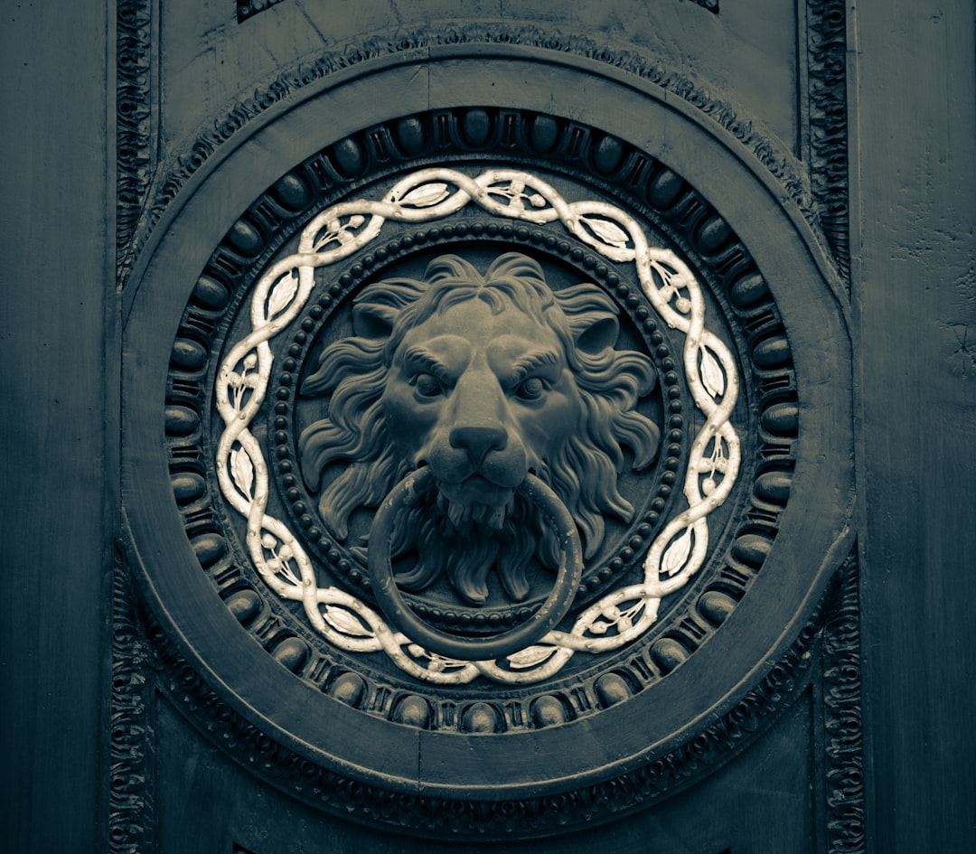
3. Animal-Inspired Tributes
Nothing says power like a roaring lion, a soaring eagle, or a charging bull. Many successful sports brands and clubs use animals to symbolize their values—strength, agility, endurance. You can create a stylized animal silhouette or even combine it with the letter of your business name to create something truly iconic.
4. Shield and Emblem Logos
Traditional forms never go out of style. Shield logos evoke honor, competition, and heritage—perfect for sports clubs or martial arts schools. These typically include banners, crests, and often initials baked into a compact and symmetrical layout. You can modernize this style with flat design principles and creative color palettes.
5. Motion Graphics-Inspired Designs
Fitness is about movement, and your logo can reflect that using lines, arrows, or blurred elements that indicate motion. These types of logos feel alive and modern, making them ideal for fitness tech startups or running clubs. Incorporating motion means you’re connecting visually with speed, progress, and forward momentum.
6. Geometric Patterns and Shapes
Geometric logos tap into symmetry, balance, and structure—traits valued highly in both aesthetic design and physical fitness. Circles can symbolize unity and continuity, while triangles speak to strength and stability. Modern fitness apps often use abstract shapes to stand out, making this style perfect for virtual coaching or data-driven platforms.
7. Monogram Magic
If your gym or sports club has a short name or catchy initials, a monogram logo could be the way to go. Think “NY” for the Yankees or the “LA” of the Lakers. You can make a monogram elegant, masculine, feminine, vintage, or futuristic depending on the typeface and styling. Add flourishes, shadowing, or simple athletic imagery to complement the initials.
8. Retro Athletic/Royal Aesthetic
Go old-school by channeling the style of vintage sports teams, varsity letterman jackets, and historical emblems. Adding stars, laurels, or old-style typefaces creates nostalgia, which can deeply resonate with your target audience—especially if your fitness offering has a heritage appeal or family-owned roots. These logos also work well when embroidered on uniforms or gym towels.
9. Silhouettes of People in Motion
Using human forms—whether sprinting, lifting, stretching, or jumping—helps build a relatable brand. A stylized figure can symbolize energy, transformation, and effort. Fitness apps and PT studios often use these visual cues to evoke action and inspiration. Make the silhouette modern and crisp, not dated or overly detailed.

10. Nature and Organic Themes
This might not be the first direction you think of, but a surprising number of wellness and yoga-focused brands are turning to organic shapes like leaves, trees, and mountains. These logos promote balance, peace, and a holistic approach to health. They’re ideal for businesses focused on outdoor fitness, mental wellness, or sustainable practices in health and sport.
11. Bold Color Palette Emphasis
Sometimes, color itself can be the defining element of your logo. Red for intensity and urgency; green for health and vitality; blue for trust and intelligence. Use strong, contrasting color combinations to give your logo a distinct personality—especially important for apps, where recognizability at a tiny size matters.
12. Interactive or Animated Logos for Apps
In the context of digital fitness experiences, a logo that can move, shimmer, or interact has the potential to elevate your app or website. While this won’t work for signage or apparel, dynamic logos can be a differentiator on mobile screens. Think of loading animations that transform the logo shape or colors that change based on goals completed.
Final Thoughts
Your logo isn’t just a design—it’s a story. Think carefully about the identity of your club, gym, or fitness app and what feeling or emotion you want to evoke. Sketch, refine, and test with real users if possible. Remember: A great logo is timeless, adaptable, and most importantly, recognizable in a glance.
Whether you’re going for fierce and competitive, sleek and modern, or calming and holistic, there’s a logo style here that can serve as the spark for your brand journey. Don’t just follow trends—follow your brand’s purpose and personality.
